


Overview
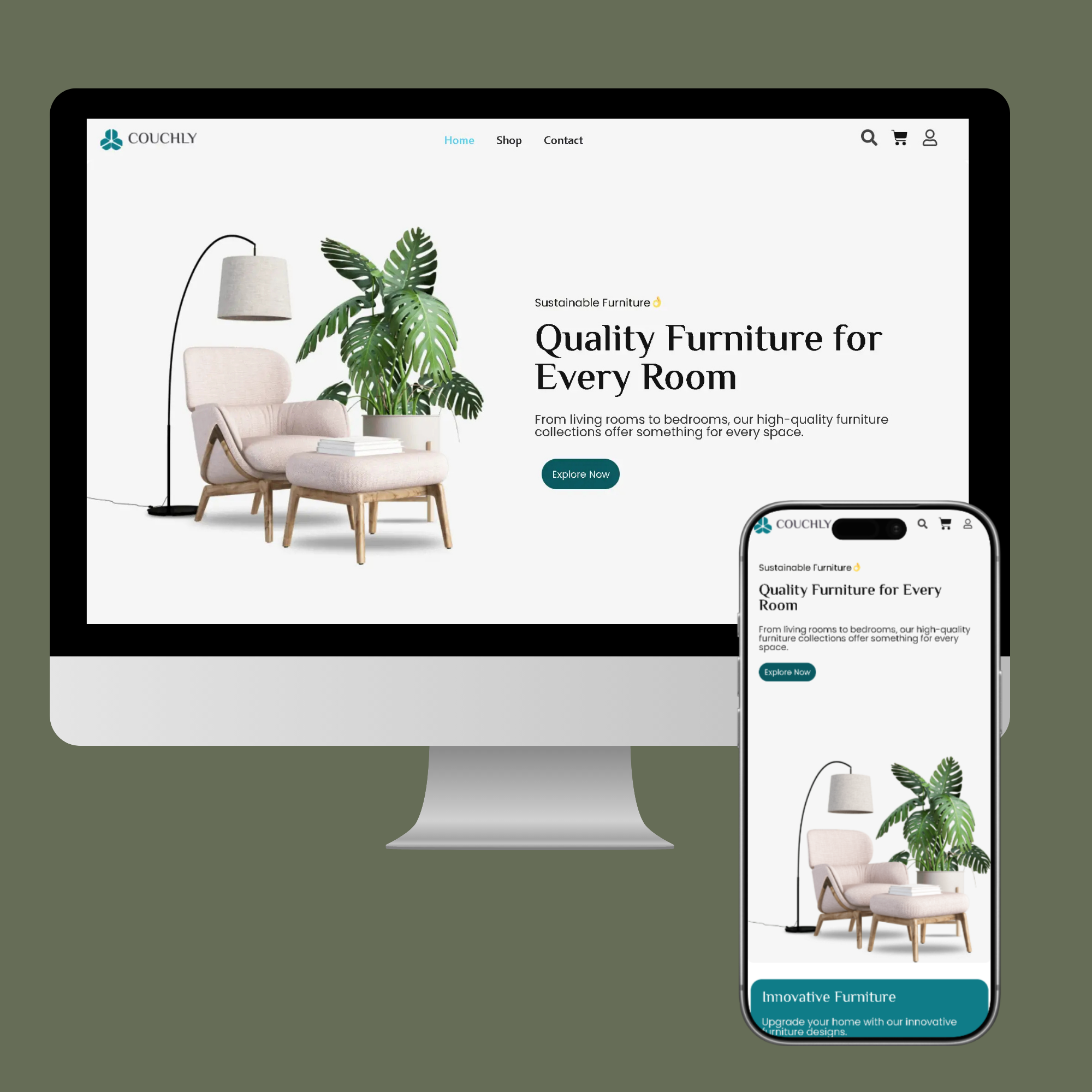
I designed a modern and minimalist homepage for a furniture e-commerce brand with the goal of improving product discovery and creating a premium shopping experience. The existing design direction was outdated and lacked structure, so the focus was on clarity, clean layout, and strong visual hierarchy.
Problem
Users had difficulty navigating products and quickly understanding what the brand offered. There was no clear flow, product sections lacked consistency, and trust-building elements were missing.
Solution
I created a visually balanced homepage that highlights the brand’s key furniture categories, best-selling products, and promotional offers. A hero banner introduces the main product focus, followed by organized product grids, a limited-time discount section, and a clear newsletter CTA. I also added trust elements such as Free Shipping, Secure Payment, and Money Guarantee to improve user confidence.
Process
- Researched modern furniture e-commerce layouts
- Defined a clean color palette and typography style
- Designed high-fidelity screens for desktop and mobile
- Structured sections for easy browsing and conversion flow
- Built consistent product cards with pricing and sale tags
Outcome
The final design delivers a smooth, modern shopping experience with clear navigation and strong visual appeal. Users can quickly explore collections, view best sellers, and engage with offers. Overall, the design strengthens the brand’s identity and supports better engagement and conversions.
Tech Stack
- ELEMENTOR
- WOOCOMMERCE
- WORDPRESS